The Scenario
I first gained experience in physical space wayfinding when I redesigned signage and floor plans for Duke University Libraries as a graduate student. Recently, we realized floor plans at the University of Montana’s Mansfield Library were:
- Overcrowded,
- Inaccessible, and
- Organized with internal users (library staff) instead of external users (students and faculty) in mind.

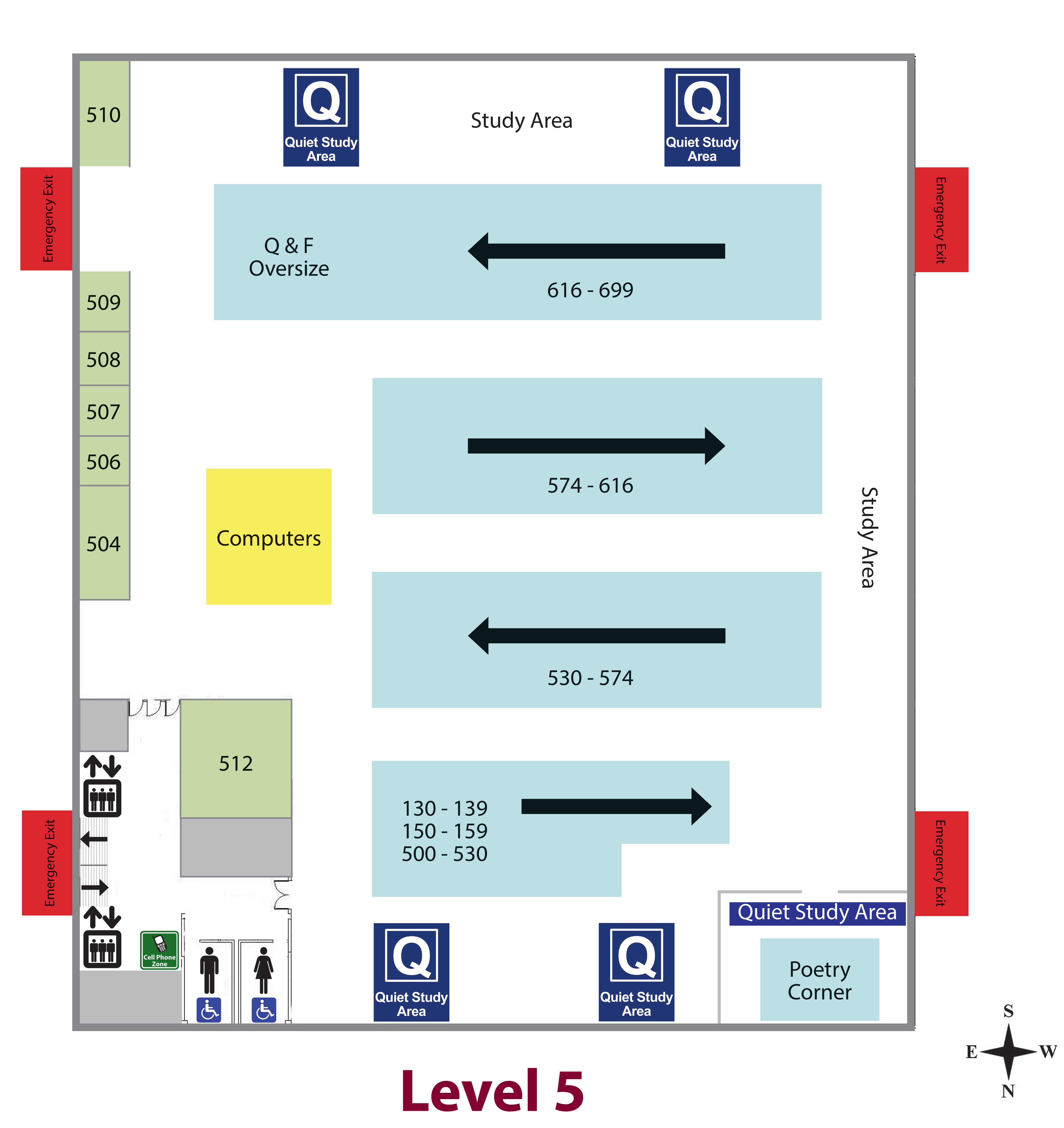
Reasonable questions and observations about this level five floor plan include:
- What do the arrows mean?
- What do the numbers in the light blue boxes mean?
- Is the whole level for quiet study or only where the icon is?
- The stairs are hard to see
- What do the black icons with the up and down arrows mean?
- Where is the elevator?
- Would this be usable in print form?
In addition to the design itself, the way it is embedded on the library website makes the page load slowly and it is impossible to interact with the graphics at all. This also makes the floor plan inaccessible.
I learned even more in initial usability testing. Eight participants were asked,
You know we have a quiet floor but you don’t know where it is. Starting from the library home page, show me how you would find this information.
Of these participants,
- 3/8 did not find the quiet floor
- Top terms mentioned were: facility, floors, floor plan, plan, levels (Note: this information is currently titled “maps”.)
- Of the five participants who found the quiet floor, one found it on the group study room page and the other floor found the maps page
- The most common first click was on “Library Services” (3 participants did this)
I also noticed that with the placement of the floor name, participants had a difficult time scrolling up and down between PDFs and understanding with floor name corresponded with each image.
The Plan
With the help of the web committee (a group of faculty and staff here in the library, which I chair) I put together a subgroup to redesign the floor plan. First, we will mockup an improved floor plan based on concerns we’ve already identified. Second, I will conduct usability testing or wayfinding activities with participants to determine how useful the mockup is and identify areas for improvement. This testing will likely be a task-oriented think-aloud protocol using the mock up to navigate through the physical space it represents followed by post-test questions.
The Solution
Now available to view online! (Update: in 2022 these maps were updated again by other staff. However, they kept my duplicative body text so that a screenreader can still access any text information from the floor plans). I also wrote and recorded audio tours to provide more ways to experience and learn how to navigate our physical spaces.