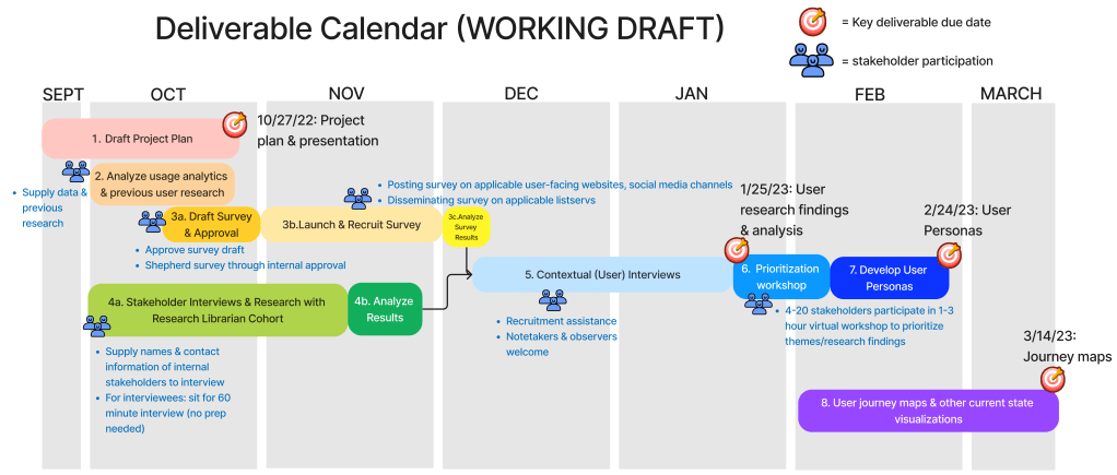
Summary: when serving as a KP (key personnel) on contracts, I’m required to do a lot of the day-to-day project management. Here’s a scenario where I designed the simplest version possible of a complex deliverable plan.
In the onboarding days of a new project, reconciling the contractual deliverable schedule with other agreed-upon touchpoints and intermediary deliverables gets complex quickly. I often suggest a Gantt chart because it allows visualization of simultaneous work streams over time on a fixed or relative calendar (Google Sheets has a new timeline feature but it will only work with fixed dates, for example: January 1-January 15, but not Week 1-Week 5). Some colleagues are dismissive of Gantt chart’s ability to relay usable information, especially when the primary means of communicating with stakeholders is text-based documents. So we often turn to finicky tables in Google Documents that take just as long to create and are less useful. Instead of that, here’s my take on a Gantt chart template in Figjam.
Pros
- Use when an organization doesn’t use agile and/or have a specific tool they use to track work (for example, Jira or Trello).
- Simultaneous tasks occur.
- High level timeline (month to month or week to week) as well as specific deliverable dates.
- Icons provided additional information and visual draw.
- Can embed into a text document as a link and/or image.
- If embedding as an image, it will probably be big enough that it should go on its own page in landscape mode. Image alt text should describe it as a visualization that duplicates information in the text of a document.
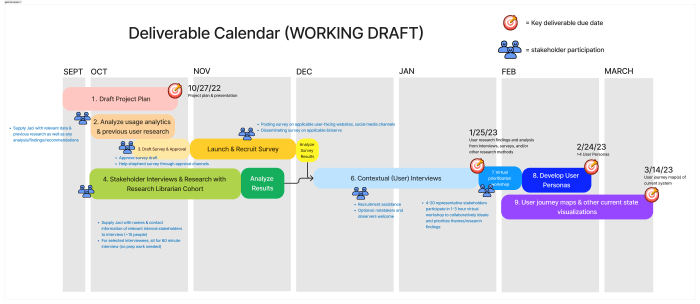
cons
- This visualization itself is not accessible; it should duplicate information that is available in a text document.
- Can be intimidating for stakeholders whose organizations have low user experience/design maturity.
- Need a visualization tool just as Figjam to create.